Historical reference. This page preserves an earlier design study; it is not the current XOCE standard. Use the current UI patterns for maintained guidance.
The study was archived on 2026-11-14 from src/pages/docs/design/ui-patterns.md at website commit 3a3c65658574d458578b497ab91b818727b819b7. Its version numbers, local-candidate/publication statements and evidence links keep their original scope. Native captures retain their original capture versions and provenance; they do not establish current release behaviour or physical-device verification.
The original article body follows unchanged, including its earlier archive notice.
This article preserves the design study and native captures from before the current releases. Versioned examples and local-candidate descriptions below retain their original scope. For current launch-preview capabilities and settings, use watch setup and the product pages. The older captures below remain historical examples.
A useful interface gives the main task enough room, keeps related content and actions together, and makes current state readable. Those common principles can apply across XOCE; their layout and controls depend on the device.
The concrete patterns below describe Pebble Time 2 interfaces and their phone settings. The watch builds target a 200 × 228 screen with physical buttons. The Pebble activity schema is a contract for compatible Pebble hosts, not a universal interface or data model for Android products.
Android implementation scope
Phone and its optional Pebble companion are planned. No Android interface patterns, screenshots or component kit have been published. Use the common principles as direction; do not treat the watch action bar, compact activity row or bundled Pebble settings controller as an implemented Android app design.
This page’s screenshots and baseline descriptions refer to the published builds. The Pebble UI and UX standard records adoption in Dynamic 0.17.0, Dashboard 0.5.0, Timer 0.13.0 and Open Activity 0.2.0 local candidates. Automated, packaged browser and native emulator checks pass; real-device verification remains separate. Those candidates have not replaced the public downloads.
Activity content and context
An activity carries source content; the consuming app decides how much space it receives. Either the primary or secondary role can contain any supported activity source. Secondary describes a space constraint, not a particular source such as Music.
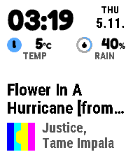
Dynamic uses these compositions:
| Area | Existing presentation |
|---|---|
| Primary activity | A larger content block, bottom-aligned above its contextual footer. It expands when no secondary row is present. |
| Secondary activity | Exactly one static row above the primary, with an optional source symbol and a selected structured value or text. A divider separates the roles when the row is visible. |
| Media primary | A title with an optional album-art and artist footer. Content and footer stay together at the bottom of the activity area. |
Useful identity can come from context, an icon or artwork with an artist. It does not always need an icon followed by a repeated provider name. A compact row still needs enough context to identify what its value means.
Text starts at its beginning and truncates at the final visible line. It never scrolls or automatically cycles. Keep a structured clock or measurement together with its essential unit; optional content yields when it cannot fit legibly.
A focused overview
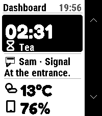
Dashboard’s Snapshot contains one activity, one notification and two pinned items. More activities and pins have their own collections. This keeps the overview’s type and values readable.
A pin can combine a reading, a tap action and an associated app. They belong to the same item when they describe the same thing. A light’s brightness and its toggle do not need separate overview rows.
Weather and phone battery can use an icon plus a value. A particular device or an action-only item needs a meaningful name so the user knows what a press affects.
The notification row stays navigable when empty or when preview text is unavailable. It retains the destination to Notifications without inventing content.
Contextual physical-button actions
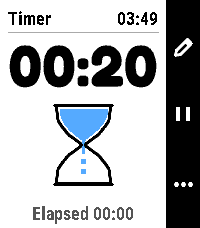
Dashboard and Timer place action icons in a right-side bar beside the corresponding physical buttons. The bar describes the selected item or current screen. Only useful actions take space.
In Dashboard, Music exposes play/pause on Select when its source declares that control; holding Select opens its associated app. Other activities may lead to useful source-provided controls. A read-only pin has no invented tap action.
Timer keeps its countdown and hourglass readable while showing the available edit, pause/resume or options actions beside the buttons. At menu bounds, unavailable movement arrows are omitted. Confirmation screens keep the target and safe choice readable.
Button meanings still need discoverable guidance. Dashboard shows a first-use guide and previews the associated app during a deliberate Select hold. The watch controls guide gives the user-facing button mapping.
State through stable content
Timer keeps a regular wall clock at the top and a fixed countdown baseline. Its hourglass connects the state to a recognisable image:
- Ready shows sand at the bottom and stays still.
- Start turns the glass upright with sand at the top; the stream uses the existing running tick.
- Pause turns the glass horizontally and freezes remaining time.
- Resume turns it upright again.
The state should also be understandable through the countdown and available action. Animation is bounded, and reopening or refreshing a timer does not replay the flip.
Phone settings with a clear job
The published baseline apps keep settings close to the thing they configure:
| Project | Existing settings structure |
|---|---|
| Dynamic | Appearance; Content & priority; Connection & help. Its activity list owns the watchface’s order and visibility. |
| Dashboard | Appearance and independent activity choices, plus a pinned-item editor combining reading, tap action and associated app. Named native/store app choices make the common path usable. |
| Open Activity | One shortcut choice for Primary and one for Secondary, with setup and help explaining the corresponding system Quick Launch assignment. |
| Timer | Timer creation, editing and options on the watch, where timers and alarms are owned. |
Phone appearance is separate from watch appearance. Opening settings or choosing a named app should not automatically focus a text input. Keep an edited item’s fields together and show relevant validation beside them.
In Dashboard, global Save includes an open pin editor. A confirmed save closes that editor while leaving the settings page open; validation or save/transport failures preserve the unfinished edit. Open Activity also leaves settings open, and an uncertain save keeps its draft and offers an explicit saved-state reload or retry. Published Dynamic 0.16.2 submits and closes its Clay page. Local Dynamic 0.17.0 adds the bundled controller for Save-and-stay with inline confirmation. The modern local configuration pages follow that workflow; legacy return-URL submission still closes.
Phone appearance in the local candidates
Appearance stays on the phone. Timer 0.13.0 adds a small Light/Dark watch-appearance page with help, while timer creation, editing and alarms remain on the watch. Open Activity 0.2.0 adds a separate Watch appearance selector alongside its Primary and Secondary shortcut pickers. These are local candidate changes, not features of the older captures above.
Platform boundaries
These are Pebble patterns shaped by its screen, buttons and lifecycle. Phone’s eventual Android interface needs its own implementation guidance; this page does not claim that work is complete. The website visual identity records web-specific choices separately. Cross-project consistency comes from clear hierarchy, honest state and predictable actions; app layouts and packaged assets remain owned by their projects.
Detailed examples live in Dynamic’s native style, Dashboard’s implementation, Timer 0.12.0 and Open Activity 0.1.6.