Current interface examples
A watchface presents shared activity data; a phone page configures its own app. Their layouts and controls fit different jobs.
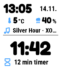
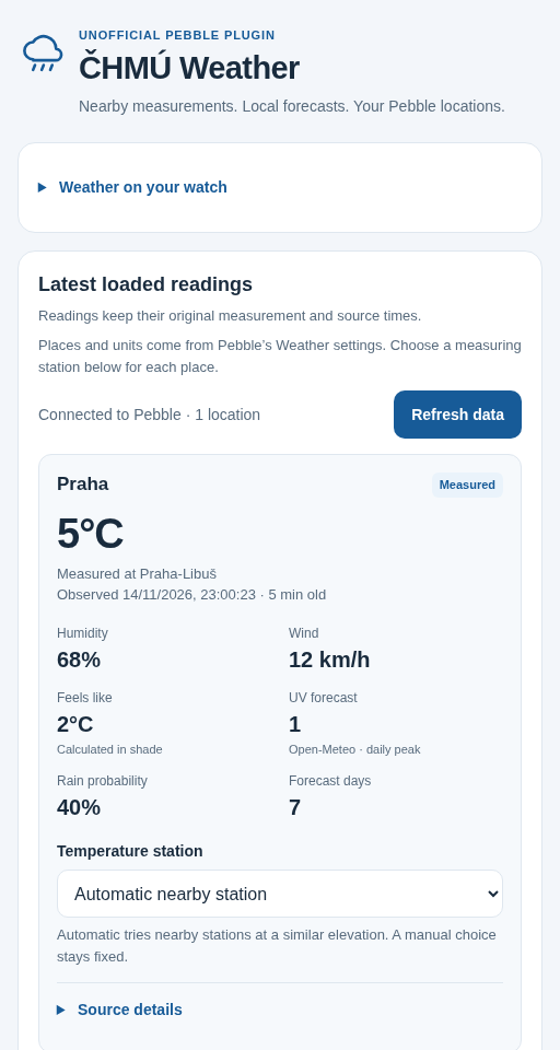
Example data; unchanged image files. Native captures establish rendering, and phone previews show bundled settings with simulated replies. Neither establishes physical-watch or live-phone behaviour. Image provenance.
The examples above show different jobs, not a universal screen template. Current Pebble watch products support Time 2 and Round 2; ČHMÚ Weather runs in the phone app. The Pebble reference owns their fitted typography and native controls. The earlier pattern study retains its original screenshots and versions.
Activity content and context
The activity owner publishes content and capabilities. The consuming watchface or Dashboard decides how much space to give them. Either Primary or Secondary can contain a supported activity source; Secondary is a space constraint, not another name for Music.
| Pattern | Current example | Rule |
|---|---|---|
| Dominant content with context | Dynamic’s Primary activity | Keep the value/title and its contextual footer together; preserve essential units. |
| Compact secondary | Dynamic and Halftone | One static row when space permits. Omit optional detail before making critical text unreadable. |
| Source-owned controls | Timer countdown displayed elsewhere | Present the remaining time; return to Timer to pause, change or dismiss it. |
| Reading plus useful action | Dashboard pin | Keep the reading, configured tap action and associated app attached to the same identity. |
A timer tick or late artwork update changes content without replacing its identity or replaying an entrance. Text begins at its start and truncates at the final visible line; it does not marquee or cycle automatically.
A focused overview
Dashboard starts with one activity, one notification and two pins. Its Activities and Pinned collections provide breadth without compressing the overview into a tiny dashboard of everything.
Use an icon plus a value when their meaning is clear. A specific device or action needs a useful name. A confirmed-empty notification source keeps a No notifications destination; unavailable preview text keeps Open notifications without invented message content.
The Round 2 composition fits its circular bands. It is not the Time 2 screenshot cropped into a circle. See native composition examples.
Contextual physical-button actions
Timer and Dashboard use a right-side action rail where the screen needs physical-button actions. Icons correspond to the nearby buttons and to the selected item. Passive Open Activity guidance and watchfaces do not need an empty rail.
Select performs the available useful action. Holding Select in Dashboard opens the selected item’s associated app when supported; a deliberate hold previews its destination. A read-only item does not gain a fake tap operation. See the current watch controls for actual mappings.
State through stable content
Timer’s countdown, hourglass and available controls explain Ready, Running, Paused and Time’s up. Motion explains a state transition and settles; reopening or an ordinary tick does not replay it. Numeric values stay legible and keep a stable baseline.
Reset returns the selected timer to Ready with its saved repeat duration; it does not immediately restart it. The owner keeps its saved timers and alarms. A countdown vanishing from a host’s activity list does not delete it.
Phone settings with a clear job
| Product | Settings job |
|---|---|
| Dynamic | Four task categories sharing one draft: layout/readings, colours, activities and help; text size and display preferences remain explicit. |
| Halftone | Its own colours, clock/depth/shadow choices, readings and ordered activities, with text size and display preferences. |
| Timer | Text size, watch appearance and Time 2 alarm sound. Timer creation and controls remain on the watch. |
| Dashboard | Display preferences, independent activity choices and a pin editor joining reading, action and app destination. |
| Open Activity | Choose Dynamic or Halftone, Primary/Secondary shortcuts, text size and watch appearance. |
| ČHMÚ Weather | Weather source/location and completion choices in English or Czech; it does not create a watch interface. |
Phone-page appearance follows the phone independently from each app’s watch palette. Save confirms phone persistence; watch delivery has its own Pending, Applied or failure feedback. Preview readings and images are examples, not live provider data.
Keep labels, help and validation with their control. A global Save includes an open Dashboard pin editor. Palette swatches need meaningful names and keyboard navigation; selected state must remain apparent without relying only on colour. The state reference describes failures and recovery.
Platform boundaries
Shared hierarchy, honest state and predictable action meanings work across XOCE. Actual watch geometry, button gestures, WebView controllers and native font resources belong to their platform and app. Website Fira/materials do not replace those interfaces.
Phone and its optional watch companion remain planned Android products. Their eventual patterns must follow their actual Android implementation, rather than treating these Pebble bindings as an Android API or completed component kit.