Native compositions
Actual Time 2 and Round 2 rendering. Shared hierarchy does not require one font or one rectangular layout across all apps.
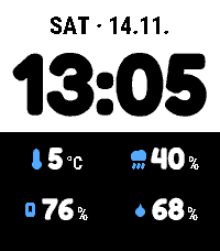
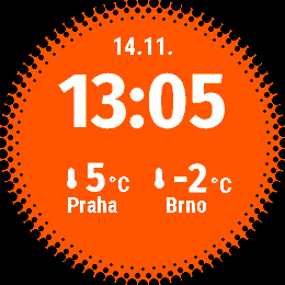
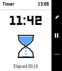
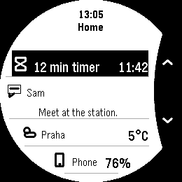
Example data; unchanged image files. Native captures establish rendering, and phone previews show bundled settings with simulated replies. Neither establishes physical-watch or live-phone behaviour. Image provenance.
This is the current reference for the six published Pebble products. It separates shared principles from fitted app-specific rendering. The historical alignment study retains its 0.x rollout descriptions and original captures; it is not a second active specification.
Platform and product scope
| Context | Current scope | Layout consequence |
|---|---|---|
| Time 2 / Emery | 200×228 native display, physical buttons | Rectangular composition; action-rail space reserved where needed. |
| Round 2 / Gabbro | 260×260 circular native display | Fit text, artwork, headers and controls within the actual circular bands. |
| Pebble phone settings | Bundled configuration pages in the official phone app | App-local drafts, persistence and watch-delivery state; phone theme independent of the watch. |
| ČHMÚ Weather | Phone-only plugin | Weather settings/provider output, with no native watch screen or launcher. |
Dynamic and Halftone are watchfaces. Timer, Dashboard and Open Activity are watch apps. Their current builds target both watch shapes; these rules do not imply support for other models. Website materials and Fira web controls belong to the separate website reference.
Watch typography and hierarchy
Share readable roles and careful fitting, not one mandatory typeface. Use the actual release’s font resources and measurement path:
| Product | Current type ownership |
|---|---|
| Dynamic | Fredoka clock/prominent values and measured Roboto Condensed supporting text; face-specific Text Size roles. |
| Halftone | Fira Sans Condensed outline clock/values and measured Roboto Condensed supporting text; Big text remains separate. |
| Timer | PebbleOS system text/menu roles through the pinned UI library; system LECO numeric fonts for the countdown. Legacy custom-font code is excluded from its build. |
| Dashboard | PebbleOS system text/menu roles through the UI library, with system LECO number roles where used. |
| Open Activity | PebbleOS system text/menu roles through the UI library for setup, clock and bounded handoff. |
| ČHMÚ phone page | Shared phone settings/system-web typography; no native watch font resource. |
The native utility roles use system Gothic/LECO font keys and firmware-aware metrics, rather than forcing Dynamic’s custom fonts onto all apps. Measure and paint with the same roles. Check complete values/units, long translations, fallback glyphs, baselines and actual ink at the relevant display size. Optional detail yields before essential data is shrunk beyond readability.
Text Size and watch appearance remain app-local. Follow options use the supported host/watch preferences and their documented fallback; they do not create an ecosystem-wide theme service.
Watch headers, actions and selection
Timer and Dashboard reserve their contextual right-side action rail. On Emery the 34px rail leaves 166px beside it; Round 2 uses its own curved geometry and usable drawing bands. Headers, warnings and footers must fit the content area. A fixed rectangular width must not be reused for the round target.
Retain a complete clock and useful context where the app’s composition includes them. Watchfaces keep their own time/date layout. Open Activity’s passive setup and transient opening attempt need no empty action rail.
Use the pinned native widgets, familiar symbols and strong selected/unselected contrast. Up/Down navigate; Select performs the available action. Back preserves normal navigation. Gesture state must not survive a target replacement or accidentally fire again after a screen change. Watch controls owns the everyday mappings.
Preserve each app’s composition
| Product | Identity and behaviour to retain |
|---|---|
| Dynamic | Adaptive Columns/Stacked rows/Four when idle; split clock/detail colours; dominant clock; Primary plus optional one-row Secondary activity. |
| Halftone | Centered Fira clock, two readings, halftone dot bezel, orange character, depth/shadow options; its own fitted activity/Peek arrangements. |
| Timer | Complete countdown, recognizable hourglass and reusable timers; explicit Reset-to-Ready; native countdown and alarm ownership. |
| Dashboard | One activity, one notification and two pins in the overview; separate collections; identity-safe actions and associated-app shortcuts. |
| Open Activity | Passive ordinary launch; selected Dynamic/Halftone source; minimal bounded Quick Launch handoff, with no missing-Secondary fallback. |
| ČHMÚ Weather | Czech station/ALADIN settings and optional completion; weather output retains source time and provenance. |
Any supported activity may occupy Primary or Secondary when it fits. Secondary is one static row, not a source identity. Music retains useful title/artist/artwork context. A source without a useful action stays read-only. Dashboard can open Timer but does not supply its Pause/Resume controls.
Watch feedback, confirmations and motion
Distinguish loading, confirmed empty, expired, unavailable and failed. Keep relevant values, target identity and supported recovery visible. Never fabricate freshness or completion.
A destructive confirmation identifies both action and target; the initial choice is safe and Back cancels. Bounded motion can explain a real state/content transition. Ready, paused and resting states remain still, while ordinary ticking reuses its necessary update schedule. Watch text does not marquee or automatically cycle.
Current native launcher files are separate transparent 25×25 black glyphs, verified against the actual launcher/picker treatment. Do not assume colour hardware automatically inverts a white icon. App symbols, Store 80/144px icons and website marks have separate roles and exports.
Phone settings layout and controls
Keep the page’s job visible: task-based sections, related help and controls, then a clear Save area. Reuse the bundled shared phone styles and each app’s supported persistence adapter. Ordinary controls should remain readable with enlarged text and comfortable touch targets; dense palettes also need explicit labels, selected state and keyboard navigation.
Dynamic uses category navigation with one shared draft. Halftone retains its own visual controls. Timer’s phone page contains text size, appearance and Time 2 sound, while timers stay on the watch. Dashboard keeps a complete pin draft together. Open Activity includes the source-watchface selector as well as role shortcuts. ČHMÚ keeps weather-provider choices in English/Czech rather than acquiring watch controls.
Phone appearance is independent of watch appearance. Preserve translated labels and provider/user text. Keep named app destinations ordinary and custom UUIDs advanced. Store search is explicit; it is not an installed-app inventory.
Save stays open
Modern bundled configuration pages keep the page open after confirmed phone persistence. The shared state table specifies clean, dirty, saving, saved, failure, uncertain and load-error states. ✓ Saved remains until another edit. Legacy return-URL submission remains a separate closing compatibility path.
Keep watch delivery separate: Saved on phone does not imply Applied on watch. Transport acknowledgement alone establishes neither persistence nor application. Save must include nested drafts, preserve failed edits and ignore stale replies. Discard restores the confirmed local snapshot, without promising to reverse a write already sent.
Phone focus, viewport and accessibility
Keep focus and visible context stable during save/poll updates. Explicit Search can focus its field; routine page entry and editor opening should not summon the keyboard. A closed nested editor returns focus to a logical control.
Associate labels, descriptions and errors with their controls. Use stable accessible status nodes and announce actual transitions once. Tabs keep meaningful selected/panel semantics; palette choices expose their colour name and selected state, with arrows/Home/End matching the actual grid. A colour change alone does not communicate state.
Save controls reserve their measured space. Short viewports, keyboards or enlarged text may require normal-flow actions so the last control remains reachable. Validate the real bundled page rather than assuming shared CSS guarantees correct persistence or accessibility.
Shared implementation and ownership
A Pebble UI package now exists. The standalone pebble-xoce-ui 0.1.1 release is its published SDK 4.33.1/Emery package. The five current native apps pin a bundled 0.1.3 SDK 4.44/Round 2 snapshot; that bundled version is not a separately published standalone release. See Integrate UI for package paths, provenance and ownership.
The package supplies shared native roles/widgets and settings presentation. App adapters still own storage, protocol/session identity, drafts, provider capabilities and native alarm/navigation behaviour. It is a Pebble-specific library, not a universal web/Android component framework.
Release basis and evidence
This reference was reconciled on 14 November 2026 against Dynamic 1.0.2, Halftone 1.10.3, Timer 1.0.3, Dashboard 1.0.2, Open Activity 1.0.2 and ČHMÚ Weather 1.0.4. The version panel above and product pages own current installation links.
Tagged implementation references: Dynamic font provenance, Halftone font provenance, Timer native type, Dashboard native UI, Open Activity native UI and ČHMÚ source.
Native emulator captures with example data demonstrate rendering. Browser previews demonstrate bundled settings with a simulated bridge. Reused images keep original capture versions and linked compatibility proof. Portable tests, packaged execution, emulator runs and real-phone/physical-watch checks remain different evidence; publication does not turn one into another.
Checks when changing an interface
- Render both native platforms, themes and supported text sizes; include long values/translations, missing artwork, errors and confirmations.
- Exercise tap/hold/release/Back, item replacement and return navigation without redirecting a press.
- Save with nested drafts, failed/uncertain writes, polling and late replies; reopen the confirmed choices and distinguish watch delivery.
- Check phone keyboard navigation, palette/tab semantics, stable announcements and narrow/short/enlarged layouts.
- Record actual device evidence separately for phone persistence/permissions, physical readability, alarm behaviour and battery use.
Preserve app UUIDs, saved choices, timer ownership, original source validity and existing licences. Change the current reference alongside a validated implementation; append new captures and keep historical evidence intact.